
Since starting Hotpot I've come a long way in my understanding of design practices and visual interaction. Upon a recent evening I was staring at my old logo and came to the realisation that I really didn't like the curls on the pot. They lacked imagery, form and an overall cleanlyness that a good designer should exemplify.
I do a lot of work with typography now, and much prefer working on white. I'm not presenting photography I'm presenting design, copywriting and marketing. If I can't express these through my logo, then I'm in the wrong industry. So I set out to prove to myself that I wasn't.
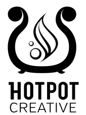
Design Goals
Remove the amature attempts at overworked imagery; break down to the base elements that express my services visually and deliver.
Results:
- Quotation marks used as form inspiration for the curls
- Logotype replaced with my favorite heading font and modified to balance.
- Curvature of pot changed to a golden ration curve.
- Colouration changed from overused and bland red on black, to a lively crisp blue.
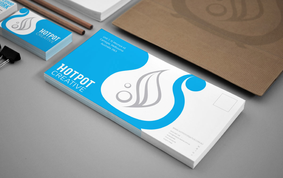
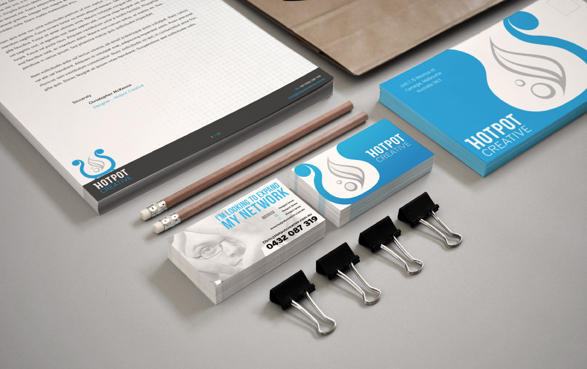
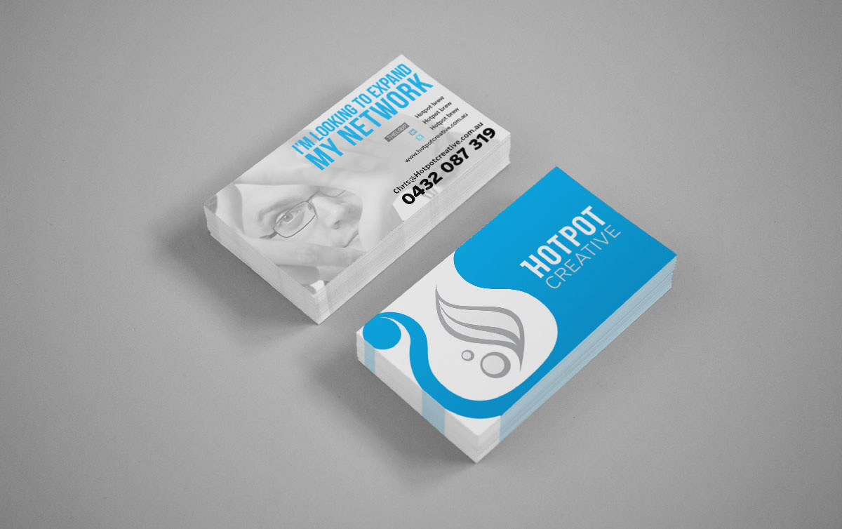
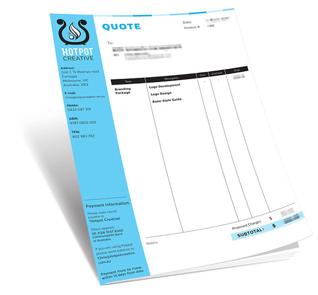
A far more flexible logo design that doesn't require a dark or wideset background. A name that is bold and legible and larger distances. And a design that can be creatively played with to great effect.

Original Logo design
Below are the original logo concepts. Although they elicited positive feedback from potential clients and colleagues when they saw them, their actual response rate was very low.